Learn the five key changes interior designers must make to their websites to attract ideal clients, keep them engaged, and turn clicks into contracts.

How to improve your website | 5 tips for interior design websites
- Your Website Isn’t for You—It’s for Your Ideal Client
Shift the focus from showing off your work to solving your client’s problems. - Keep It Simple and Clear
Ditch the clever labels—make your site easy to navigate and act on. - Make It Easy to Take the Next Step
Add bold, clear calls-to-action so visitors know exactly what to do. - Showcase Your Value, Not Just Your Work
Don’t just display projects—explain the results and process behind them. - Don’t Hide Behind Your Design
Make it personal. Show who you are and how someone can hire you, fast.
Let’s be real—your website can either bring in dream clients or send them running. And if you're an interior designer, it’s not enough to just have a stunning site that shows off your work. That might impress your peers, but it doesn’t always speak to the people who are actually looking to hire you.
At Savclicks, we’ve worked with plenty of creative professionals who built gorgeous websites that failed to do one thing: convert. They were packed with pretty pictures, clever copy, and artistic flair—but they were missing the structure and strategy to turn casual visitors into booked clients.
So in this post, we’re going to break down exactly how to flip the script and build a site that’s not just beautiful, but effective. One that works for your business and your bottom line.
1. Your Website Isn’t for You—It’s for Your Ideal Client
Here’s a tough pill to swallow: your website isn’t about you.
Most designers treat their site like a digital resume—one big brag board of past projects, credentials, and design awards. But unless your dream client is hiring based on how many high-res images you can fit in a carousel, that’s not going to cut it.
Your website needs to speak to the people you want to work with. That means identifying who they are, what they’re struggling with, and what they’re hoping to achieve by hiring someone like you. Whether it’s a busy family needing a kitchen makeover or a young professional revamping their first home, your messaging should speak directly to them.
Start by flipping your copy. Instead of “Here’s what I’ve done,” try “Here’s how I can help you.” Make your ideal client the hero of the story—and position yourself as the expert who’s going to guide them to the finish line.

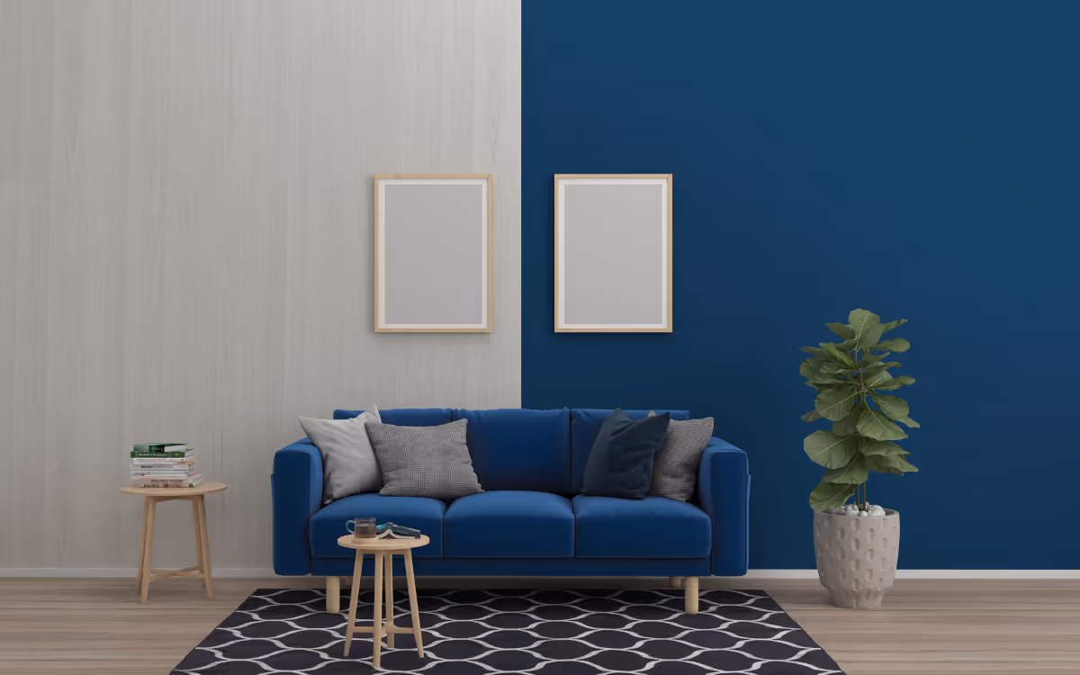
2. Keep It Simple and Clear
Most visitors will decide whether to stay on your site within 5 seconds. That’s all you get. So don’t make them work for it.
We see a lot of designers trying to be clever. They rename their blog to something like “Notebook” or hide service info under vague headers like “The Process.” While it might feel artsy or unique, it just confuses people. If they’re unsure what to click or where to go, they’ll bounce.
Here’s what a clean, clear layout should look like:
And each one of those pages should have a clear purpose and a call-to-action. If someone lands on your Services page, there should be a big, bold button that says something like “Book a Discovery Call” or “Get a Free Quote.”
Clarity beats creativity every time when it comes to converting website traffic.
3. Make It Easy to Take the Next Step
If your site doesn’t guide people toward the next step, don’t expect them to figure it out on their own. People are busy. They’re not going to hunt for your phone number or wonder how to hire you. That’s your job.
Every single page on your site should have a clear path forward. Whether it’s booking a call, filling out a form, or even downloading a free guide—make it obvious.
Add clickable contact buttons, embed simple inquiry forms, and repeat your call-to-action more than once. A sticky “Schedule a Call” button on every page can work wonders. And don’t hide your contact info—put it right where they can see it.
4. Showcase Your Value, Not Just Your Work
Yes, your portfolio matters—but it’s not the whole story.
Too many designers rely solely on beautiful project shots to do the selling for them. But visitors want to know more. They want to know why you chose that layout. How do you help the client? What problems did you solve along the way?
Start telling the story behind the space. Use before-and-after photos. Share testimonials. Explain how you helped someone who was overwhelmed by choices, short on time, or had no clue where to start.
Even better? Show your process. Walk visitors through what it’s like to work with you, step by step. Make it feel easy, approachable, and professional. That transparency builds trust, and trust turns into bookings.

5. Don’t Hide Behind Your Design
Great design is important, but it’s not a substitute for clear communication.
At the end of the day, visitors need to know who you are, what you do, and how to get in touch with you. Don’t make them scroll endlessly or dig through hidden menus to figure it out.
Put your contact info in your header or footer. Include a friendly, personal photo on your About page. Write in a voice that feels human, not like you copied it from a design magazine.
Remember: people hire people, not portfolios. If they feel like they know you, they’re way more likely to reach out.
Conclusion
Your website is more than a digital business card—it’s your #1 sales rep. But if it’s all about you, hard to navigate, or missing key info, it’s costing you clients.
Take some time this week to audit your site. Ask yourself: Is this clear? Is it easy to take the next step? Does it speak to my ideal client?
Pretty sites win design awards. Smart sites win business.
If you want a website that actually pulls its weight, shoot us a message at Savclicks. We help designers like you build websites that look great—and bring in real leads.

FAQ
1. Why isn’t my beautiful website bringing in leads?
Because beauty isn’t enough. If your site’s not built with strategy, clear navigation, and a strong call-to-action, it’s just a digital art piece—not a sales tool. Your site should speak to your ideal client’s problems and guide them to work with you.
2. What should I include on my homepage?
Keep it simple and client-focused. Highlight who you help, what you do, how you do it, and how someone can take the next step. Add a clear CTA like “Book a Call” or “Get a Quote” above the fold.
3. How do I know who my ideal client is?
Think about your favorite past projects. Who were those clients? What problems did they come to you with? Your ideal client is the person you want to work with most, and your site should speak directly to them.
4. Should I still show off my portfolio?
Absolutely—but don’t let it do all the talking. Pair your portfolio with short write-ups that explain the goals, challenges, and results of each project. Tell the story, not just the style.
5. Do I really need a blog?
If you want to build trust, improve SEO, and show your authority, yes. But call it what it is—a blog. Not “musings,” “journal,” or “notebook.” Make it easy to find and useful to read.
6. How can I make it easier for clients to contact me?
Put your contact info everywhere. Header, footer, contact page. Use buttons that say exactly what you want them to do. Keep forms short and mobile-friendly. Don’t make ‘em dig.
7. What’s the biggest website mistake designers make?
They make the site about themselves instead of the client. It’s not your resume—it’s your pitch. Talk less about you, and more about how you solve problems for them.
Let's get your online presence
working as hard as you do.
Schedule a call

.avif)